Designing and printing Hello Web App's PDF and paperback editions
Had I released Hello Web App as digital files only (as a lot of other self-publishers do), my life would have been a lot easier. However, I just couldn't say no to having and selling a gorgeous paperback book.
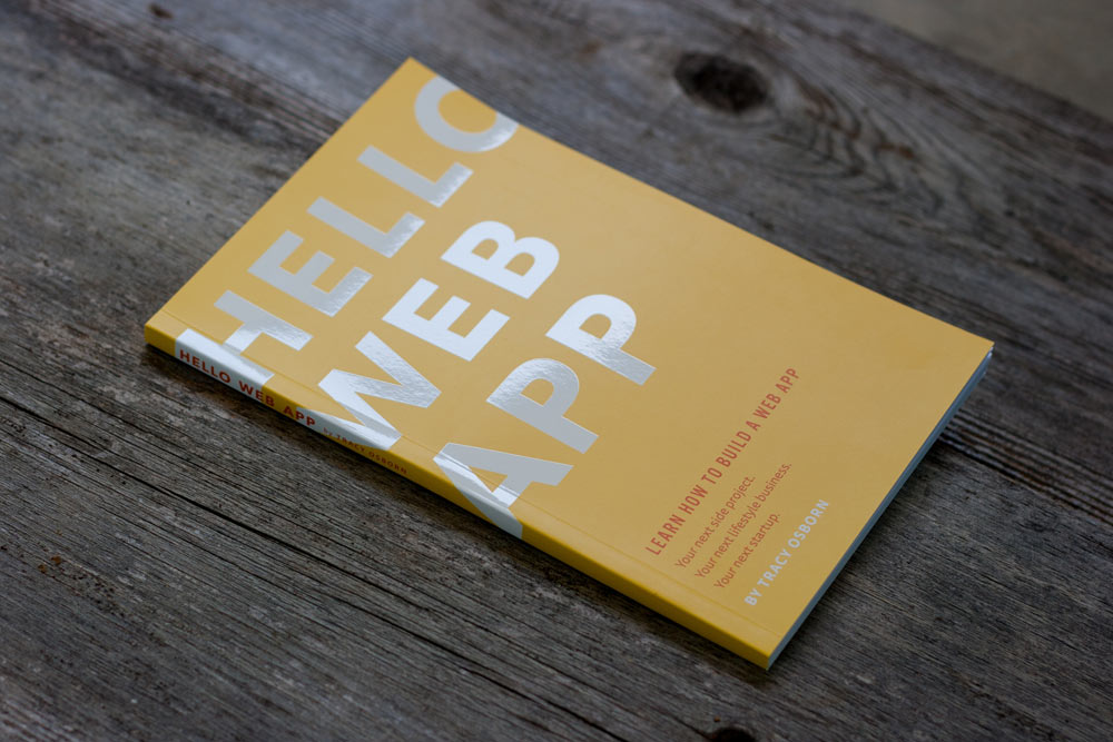
I've been traveling through Europe and being able to whip out my book at any meetup and show it off has been so much fun.
Unfortunately, creating a paperback book (compared to digital books) is a pain in the ass. At least I had experience with the process from my degree — I have a BFA in Art & Design with a concentration in Graphic Design. My favorite class was editorial design. My final portfolio was a hand-bound book. Now you can see why I can't resist releasing a physical book.
I can't detail exactly how to design a book, but here's a look into my process of designing Hello Web App.
Interior design
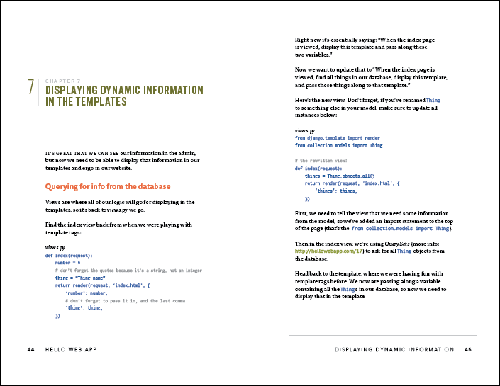
I haven't done any editorial design in about 10 years (egads, I'm old) so the first things I did was go to a local bookstore to check out other programming books and see how they were formatted. Turns out, it's really hard to find well-designed programming books.
I found a small few that I liked and took notes about what I thought worked well and what would be a good idea to implement in my own book. I also own quite a few books (including a few by A Book Apart, which has fantastic design) and used them for reference, and browsed book designs and typography on Dribbble. All of these sources influenced the design of my book.
Oh ho I thought I was done with the print design, and then I figure out baseline grids. Updating everything AGAIN! pic.twitter.com/7SJQ2oQ7yh
— Hello Web App (@hellowebapp) March 3, 2015I also paid for a Skillshare account for a bit and watched some classes on typography, editorial design, and working in InDesign — leading to revelations like the above. I highly recommend Skillshare's online design classes.
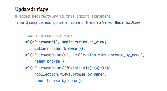
Styling the code blocks was the hardest part. I wanted the code readable, but I didn't want the book to be a rainbow of colors, so in the end I settled with blue text to set it apart, bolding the important parts, and greying out comments. In future editions, I'd like to add line numbers but it was too much of a pain for this edition.
Don't know if I'll ever be 100% happy with the @hellowebapp typefaces. Wondering if I should have a by-hand feel… pic.twitter.com/lQh7txQfa7
— Tracy Osborn (@limedaring) February 7, 2015The headlines went through quite a few iterations before I was (mostly-)happy with them. A few rejects can be seen above.
I ended up using quite a melangé of fonts — the text is set in Tisa Pro with Tisa Sans Pro for sub-headlines, headlines are set in Alternate Gothic No. 3 D, the code is set in Inconsolata, and the cover headline and page footers are set in Avenir. Generally I don't recommend having so many fonts in one book but it does seem to work okay with Hello Web App.
Cover Design
I wanted something that was eye-catching and "design-y" but also something simple and clean since that's more my style. So I used the oldest trick in the book — making the title gigantic and slightly oversetting the text.
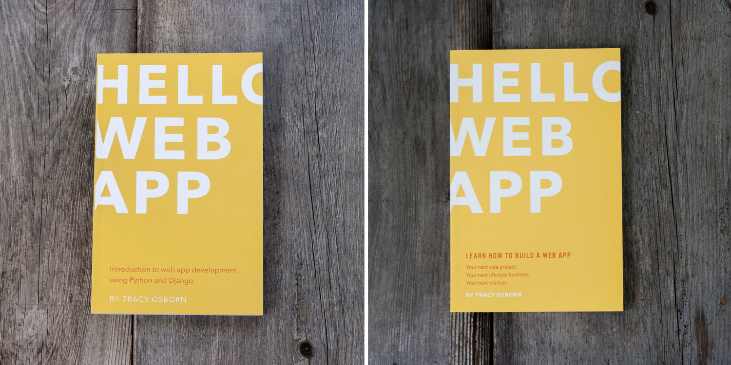
I printed a preliminary version of the book so I could get photos up on the website as well as have an object I could bring to events and workshops, which you can see on the left. I was mostly happy with the title text, but made some major updates to the sub-headline. I wanted something a bit less literal and dropped mentioning "Python and Django" to say simply "web apps."
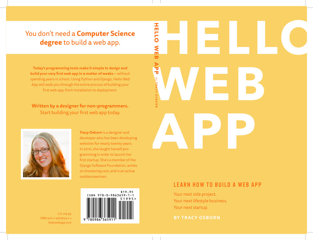
The spine and back cover took me a long time to design. Of course, I needed to add an ugly barcode (more on that below) as well as froo-froo about-the-author-why-i'm-awesome text. I'm fairly pleased that I was able to extend the white of the "H" in the cover title and wrap it around to the back cover for some visual interest. It also helps the spine stand out.
Barcode and ISBN
Keep in mind that if you're thinking of trying to sell your book at a bookstore, you'll need to get a barcode as well as a different ISBN number than your digital edition. Both of these can be bought for a ridiculous amount of money from Bowker, a very annoying company that has a monopoly on selling these things in the US. Individual ISBNs are horribly expensive — $125 — but the price drastically goes down for bulk orders (100 ISBNs are only $575).
ISBN's are cheap for the big publishers but ridiculous for the self-publisher. Bowker will try to upsell you to other unneeded services during checkout too. This whole thing is a necessary evil, and something I really hope gets disrupted soon.
Printing
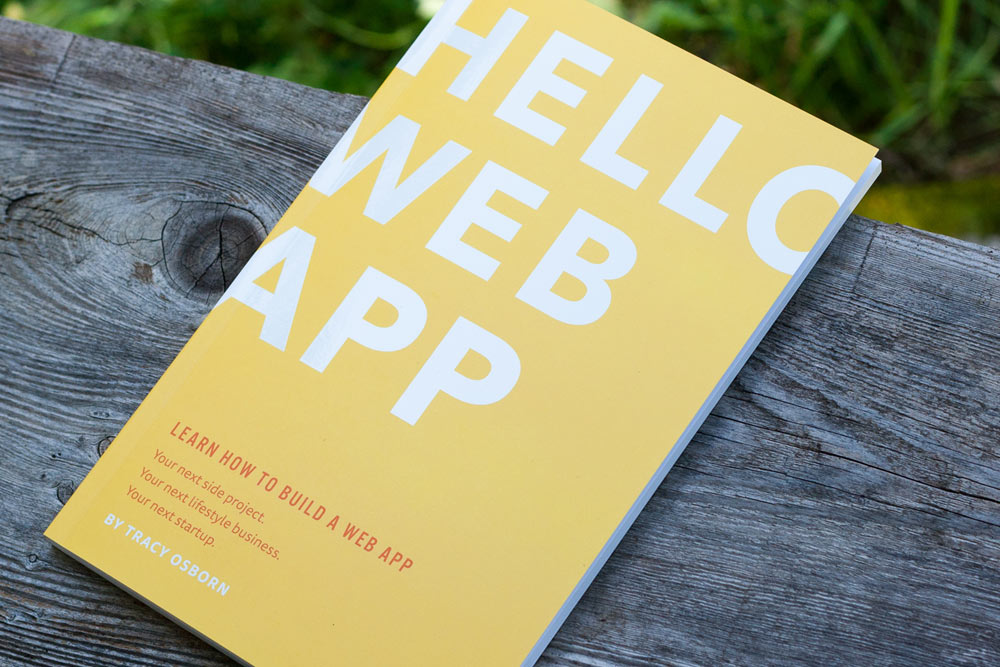
I really wanted to support a local printing company, I really did. I was recommended Edition One Books in Berkeley, California, and each book (if I ordered 1,000) would run me ~$10. Unfortunately, if each individual book cost that much, I wouldn't be able to sell them on Amazon and still see any sort of profit since Amazon takes 55% of every purchase.
I ended up working with Print Ninja which does its printing in China. For my order of 1,000 books, with additional charges for rush shipping of 200 as well as heavier cover paper weight, interior paper weight, as well as a spot gloss on the cover, I ended up with a cost of $3.60 per book. Print Ninja also has some of the best email support I've ever used.
The biggest downside was shipping time — books are transported via cargo ship, which meant 800 books took two months to get to me (I paid a big premium to ship 200 by air). I was rushing to get the books out as fast as possible and this significantly delayed everything. So if you work with Print Ninja (and I recommend you do) keep in mind the shipping time.
Photographing
Quick note on this subject — the books were photographed with a [basic Canon DSL](http://amzn.to/1TrKSpP_ with a fixed 50mm f/1.8 lens on some random wooden boards I found in my yard. A good-enough cheap-enough camera to create good-enough shots to use in my marketing and website.
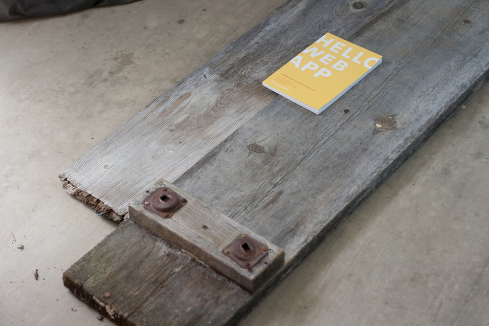
I stood on a chair to get most of the shots. I wanted a nice textured background and these boards worked well. Previously for photographs I've used a well-worn picnic table as well. You can also photograph in a bathtub for a clean, smooth white background. Professional photos are not that hard, and make a big difference over mockups.
Conclusion
I labored for weeks on the Hello Web App design and I am super pleased with how it came out. Thankfully, the design framework I built for the book is reusable for the future books I'm looking into creating (same type and layout, update the colors, new headline, done with design — hopefully.)
Next up, I'm going to review the fulfillment process — from packaging the books securely for shipping, hiring an assistant to help out, and buying labels online to ship a mass amount of books each week without losing my mind.
I have quite a few other articles about the Hello Web App design and production process that you might want to read:
- I self-published a learn-to-code book and made nearly $5,000 in pre-orders
- Hello Web App's Kickstarter campaign: How I did it, what I regret.
- Economics of self-publishing a book via Kickstarter: Hello Web App's story
- My adventures and advice on fulfilling orders for a printed self-published book
Of course, you should buy Hello Web App if you're interested in learning web app development. You can download a sample of the book by signing up for the newsletter at the bottom of this page.
You should follow me on Twitter for more fun self-publishing tidbits, startup whining, and dorkiness: @limedaring