Design for non-designers: Part 2
Part 1 of this article series focused on the visual (since that’s usually what folks are looking for help with when it comes to design), but it’s important to remember that usability trumps beauty.
The most gorgeous website in the world is useless if folks using that website can’t achieve what they want to do.
Don’t forget the user experience.
It’s more important that your design works well than how it looks. How to tell whether your design is working well?
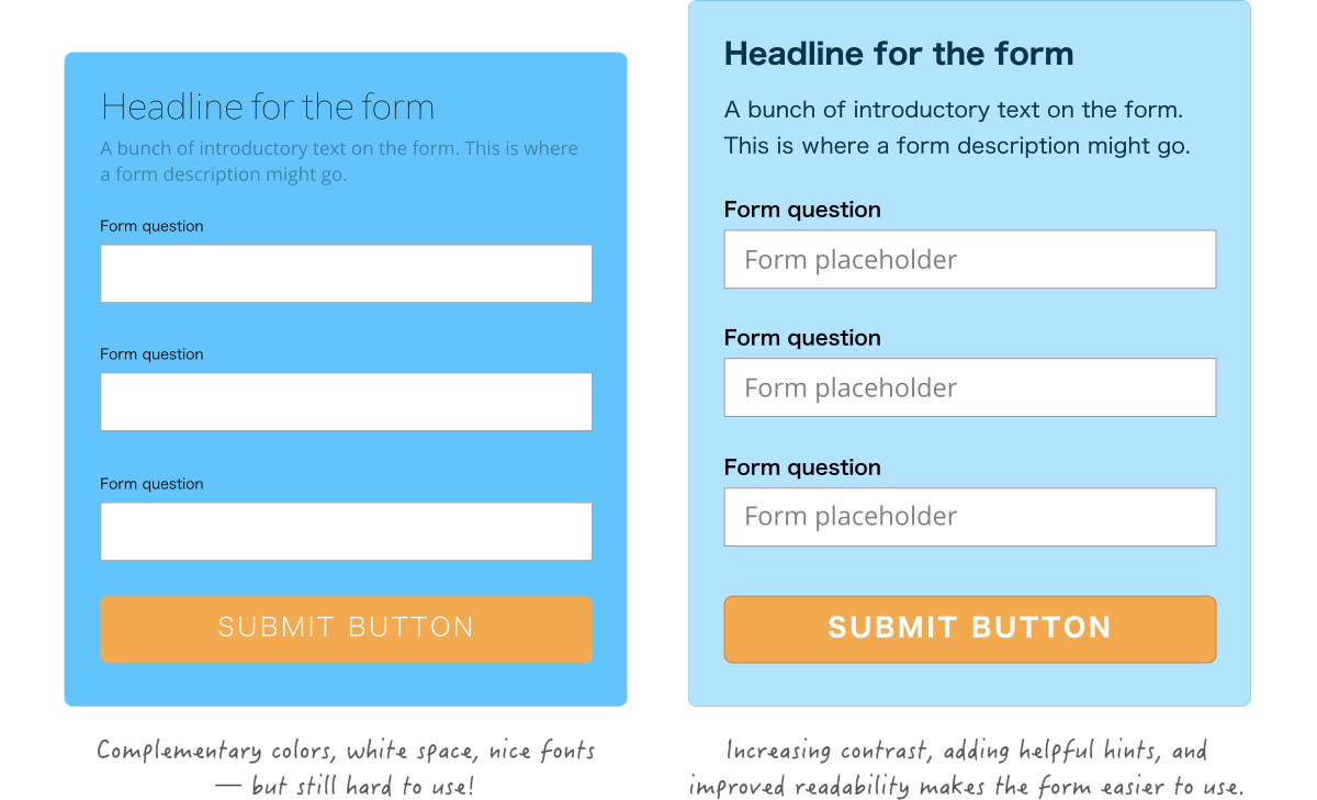
To illustrate this, think of a form.
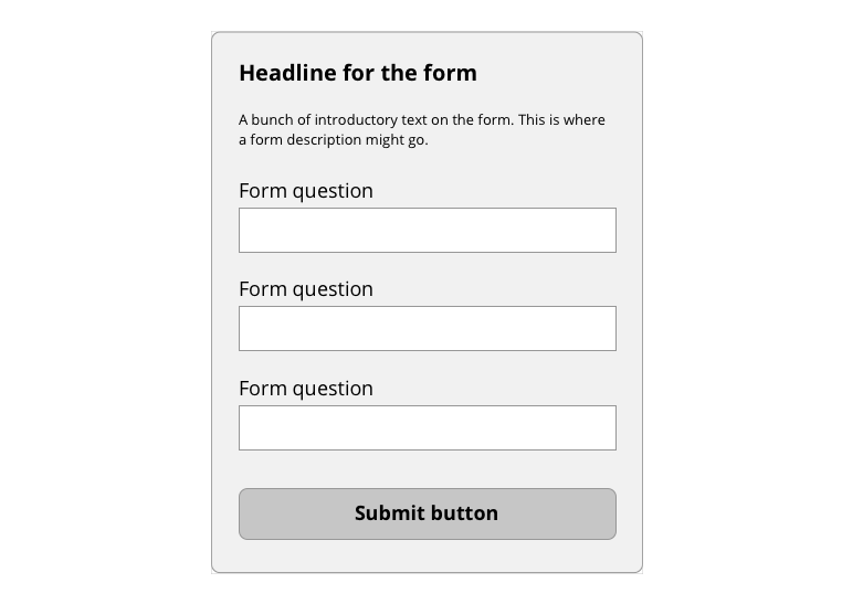
We can use design tricks like reducing clutter and better typefaces to make the form look nicer, but we also need to make sure it’s easy to read and fill out.
Of course, this tip really depends on what you’re designing, so here are some general thoughts to help you keep thinking about user experience.
Determine the purpose of your site.
For a personal website, perhaps you want folks to visit as many pages as possible. For a form, the number of submissions is probably the most important metric.
Make sure you’re thinking about that purpose when making your design.
Make decision decisions that make it easier for folks to fulfill that purpose you determined for what you’re designing. That’s why the most important buttons (the ones we want folks to see and click on) are bright, clickable colors.
Think about what you want people to do, and focus on building a design that helps, not hinders, folks from completing that purpose.
A lot has been written about improving usability and the number of visitors who achieve a goal (otherwise known as “conversion rate”). Here are some great articles:
- 8 Ways to Improve the Usability of Your Website on Quicksprout
- 5 Design Principles To Instantly Boost The Conversion Rate Of Your Website on VWO
- 5 Psychological Principles of High Converting Websites (+ 20 Case Studies) on Kissmetrics.
Content matters.
Your headlines, paragraphs, form labels, button text—your content matters just as much as your visual design. What you write can drastically affect whether your visitors understand what you’ve designed and whether they complete the purpose of your design.
Some basic rules of thumb:
Less is more. Cut down on text clutter.
In Part 1 of this series, we talked about design decisions we can make to reduce clutter. Guess what — clutter matters when it comes to content as well!
Big paragraphs of text are intimidating. Folks on the web primarily skim websites, so giant paragraphs of text are more likely to be completely skipped than read thoroughly.
This sentence is long and wordy:
Please note that although Chrome is supported for both Mac and Windows operating systems, it is recommended that all users of this site switch to the most up-to-date version of the Firefox web browser for the best possible results.
Same sentence, rewritten for simplicity:
For best results, use the latest version of Firefox. Chrome for Mac and Windows is also supported.
(Thanks to Peachpit for the example.)
In a nutshell, shorten and simplify your writing. Avoid the temptation to use large words or wordy sentences to cover all the bases — the shorter and simpler your sentences, the more likely they’ll be read, understood, and even translated into different languages.
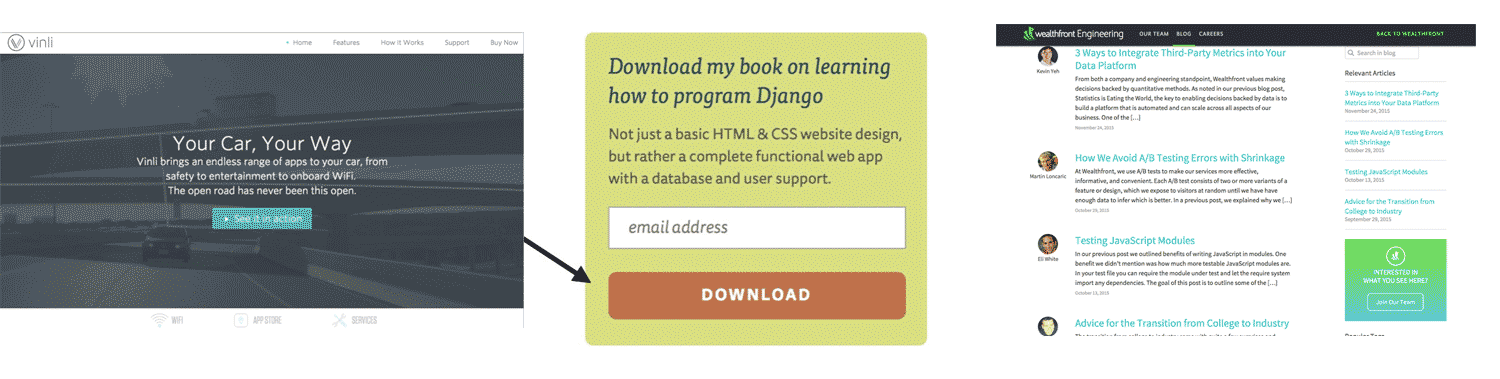
Rewrite your headlines to talk benefits, not details.
Improve the excitement and interest in what you’re “selling” by writing headlines that tell users why they should be excited. When you’re writing a headline, the first thing to pop in your head might be to explain what the product does. “So-and-so is a designer.” “This thing is a widget.”
Revamp that headline into talking benefits for the person reading it. “So-and-so designs usable and beautiful websites.” “This thing improves website conversions by 30%.”
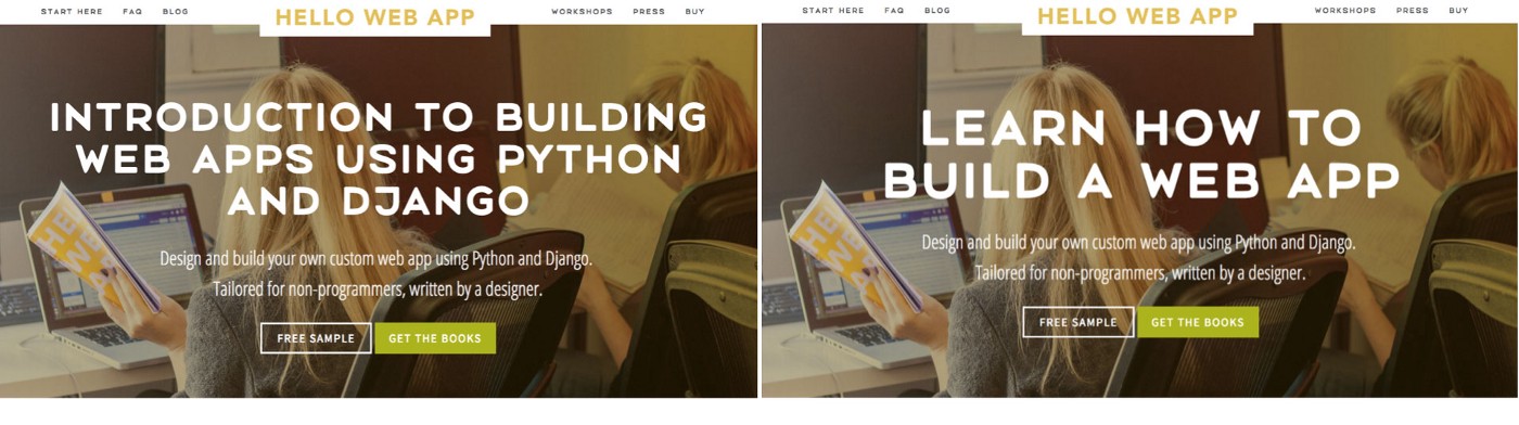
Content changes like this can drastically improve conversions (the amount of people who hit your website that does what you want them to do), making what you design more effective.
For more reading about content, check out these resources:
- Five tips for improving your technical writing and documentation
- Case study: How a simple headline change improved conversions by 52.8%
- Always Use a Benefit Headline
How to check your design for usability problems.
The best way to find problems with the user experience and usability of your design is to run quick usability tests. This can be tough psychologically, because you’ll need to show what you’ve designed to others and get feedback, and sometimes that feedback might hurt.
Divorce your feelings from your design. It might be hard not to take negative feedback personally, but fixing the issues you might find with the usability of your site is more important. The more you reach out to others for feedback, the easier it’ll be.
My step-by-step process for finding usability errors in my designs:
1. Take a break and look at the design with fresh eyes.
Since you made your design, it’s going to be hard to see any usability issues — after all, you know where everything is and how to use everything because you’re the one who built it.
Taking a break from the design, a couple hours or, even better, overnight, means you can look at the design with fresh eyes and catch some problems you might have missed earlier.
2. Run your design by friends and family.
The least intimidating folks to ask for help will be your friends and family, but keep in mind they’ll also be resistant to giving you any sort of negative feedback. Make sure to remind them that you want more feedback than just, “Looks awesome, good job!”
3. Run your design by strangers and watch them use your site.
The most honest feedback will come from folks you don’t know, but this is also the hardest feedback to get. For small stuff like your personal website, you can probably skip this step, but if you’re working on a website for a project you want customers to use, this step can find crucial issues.
Here’s a great article on running quick and dirty usability tests.
In conclusion, make sure your design works as well as it looks.
The best looking design means nothing if your users can’t achieve what they or you want them to do.
- Think about the purpose of your design, whether it’s getting someone to fill out a form, to find information, or something use.
- Make sure your designs support that purpose and improve the user experience with that in mind.
- Don’t forget about your content — simplify your words and write content and headlines that talk benefits, not details.
- Show your designs to others and get feedback to find where user experience issues might be hiding.
This is a three part series on design for non-designers. See Part 1 about design and clutter here and Part 3 about training your design intuition here.
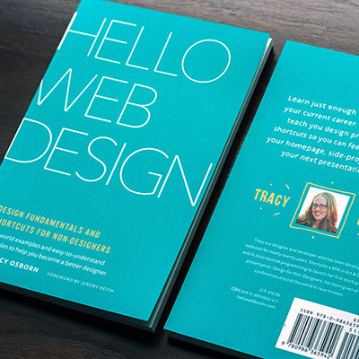
You can get even more info and tips in my book! Hello Web Design will contain not only the above information but also theory and best-practices in down-to-earth and easy-to-understand terms aimed at programmers and non-designers.
Prices start at $14.95 for the eBook.
Thanks everyone! For any questions, follow and message me on Twitter.
Thoughts? Questions? Let me know in the comments below!