Design for non-designers: Part 1
Even if you’re not a designer, I’d bet that at some point in your career you’ll need to do something visual, whether it’s making a landing page for your project, designing a form, creating your personal website, or making slides.
So, part one — what’s the one main thing to remember when designing?
Reduce clutter.
That’s it. Focus on just this one thing. If you want your design to feel more beautiful, reduce visual clutter.
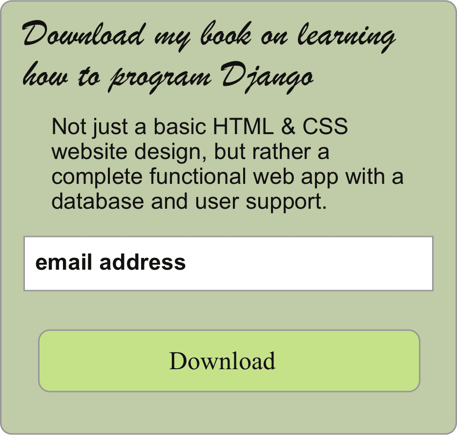
I made these little widget to help illustrate these clutter-busting tips. As we go through the concepts below, we’ll apply them to the widget and see how it starts to look more cohesive and visually appealing.
Let’s get started!
Reduce clutter by adding a grid to line things up.
There’s an anecdote often told about the strife between designers and front-end developers: A designer gives a mockup to a developer, who implements the design in code. The designer then complains that so-and-so element is two pixels off, causing the developer to roll their eyes — two pixels? That’s so small it shouldn’t matter! Silly designers and their nitpicking!
However, small misalignments might be hard to see, but contribute to a feel of “clutter” within a design. Elements can feel randomly placed and not harmonious when they’re not aligned with each other.
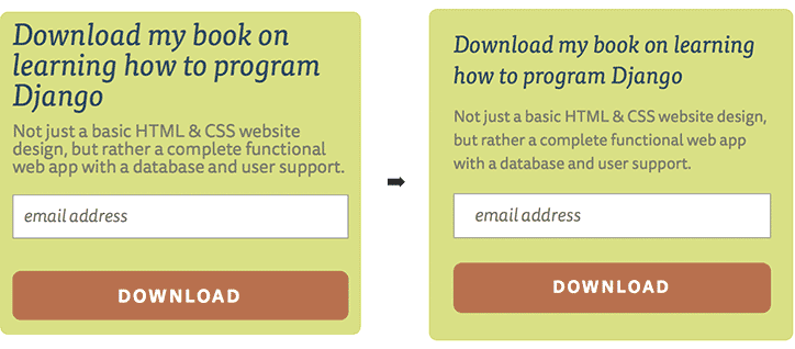
It’s easy to add accidental misalignments by accidentally adding extra padding and margins to headlines and content. In the example above, the screenshot on the right has even margins and padding, and all the elements are aligned to the same left grid, leading to a more cohesive and professional-looking design.
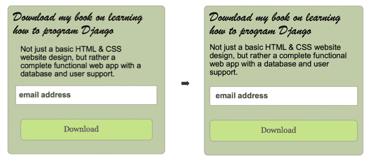
In our example widget, the left and right margins were all over the place. Aligning those margins instantly makes the widget feel less chaotic.
In short, reduce the clutter-y feeling by lining things up.
For web work, use shortcuts by using front-end web frameworks that include a grid, such as Foundation, Bootstrap, Skeleton, and PureCSS, which’ll make it near-impossible to use random placement of HTML elements.
For non-web-design work and mockups, you can also use grids and guides within design programs like Sketch, Photoshop, and Gimp.
Reduce clutter by limiting the colors in your design.
It can be super tough to choose colors, one of the reasons why color theory is often a semester-long class at design schools.

One thing we can see in the old GoDaddy site above is the sheer numbers of colors used throughout the design. Red, green, orange, dark grey, light grey, yellow, and blue all are featured — and this rainbow display of colors contributes (along with other factors) to a severe feeling of clutter.
The current GoDaddy website is much cleaner, using the same shades of black, green, and orange throughout the design. The photo is also mostly gray, allowing it to fade to the background and let the green button on the form stand out.
There is a lot of theory and best practices behind choosing colors that would overwhelm this article, which is why here especially I advocate for using shortcuts.
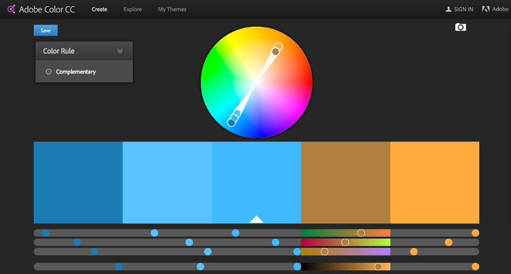
Choosing a color palette from scratch is a tricky business, which is why I like to rely on websites that showcase pre-built color palettes or help you build palettes from a base color, such as Colormind, Adobe Color CC, and Colorblendy. These sites will help you build a palette that contains a small number of colors that work well together.
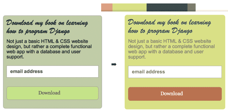
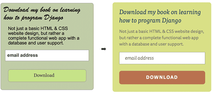
For our widget, we grabbed a palette and applied it to the widget. Note that not all colors have to be used, and the neither does the exact colors specified in the palette. The new “Download” button is not quite the same dark peach as in the palette, but the palette gave us a great starting point.
If you’d like to learn more about the process of building colors, I’d recommend this excellent article on Smashing Magazine: A Simple Web Developer’s Guide To Color.
Reduce clutter by reducing the number of fonts you use.
Thank goodness we have more fonts available to us now! Gone are the days of only having a few fonts to choose from.
Typography is another big subject that can be overwhelming. Serif, sans-serif, monospace, display, web-safe, and slab are all terms used to describe and categorize fonts and typefaces (terms which are generally used interchangeably for non-typographers).
There are a lot of guidelines when it comes to choosing a font but I like to recommend just two to start: Use only two fonts per design and avoid fancy/display fonts.

Our original widget on the left uses four different fonts, and our refreshed widget on the right uses just two. The new widget uses styles like italics and all-caps which still lends a feeling of difference between different elements but overall feels more cohesive.
But choosing two fonts with all the options we have available can still be overwhelming. Sites like Typekit (free to $99/year) and Google Fonts (free) are great resources for professional, beautiful fonts, but contain hundreds of options to choose between them.
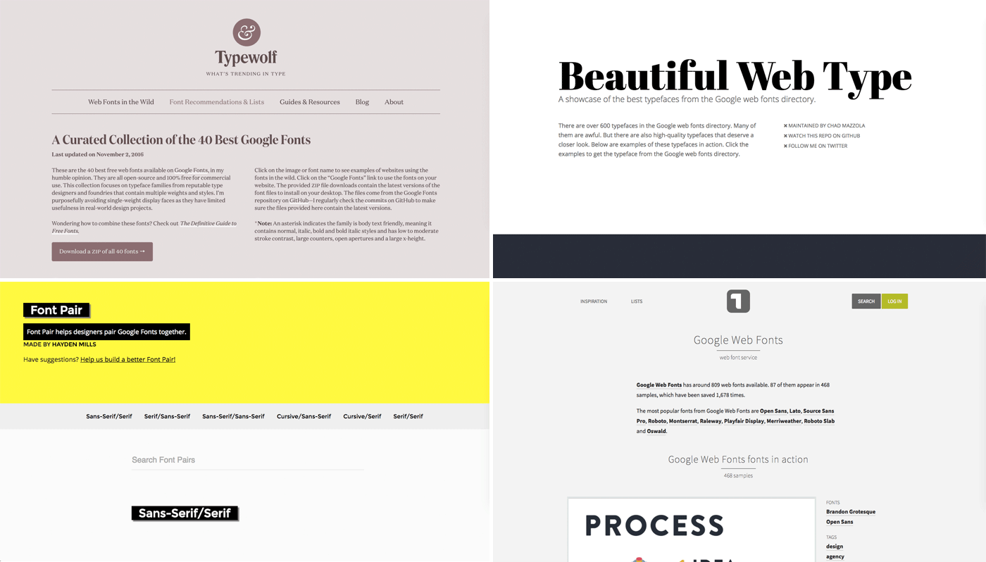
Reduce choice by using a font-curation site to see a more limited number of fonts and see them in action. A number of websites list the best Google Fonts available, including Typewolf, Beautiful Web Type, Font Pair, and Typ.io. No longer will you need to scroll through hundreds of fonts—simply browse these sites until a combination feels right for you and your situation.
For more about choosing typefaces, check out this excellent Smashing Magazine article: How To Choose A Typeface — A Step-By-Step Guide.
A Book Apart also has an excellent book that goes into web typography in detail: On Web Typography
Reduce the feeling of clutter by adding whitespace.
Whitespace is the ultimate clutter reducer.
We have a tendency as beginning designers to push too much information close together. Large, empty gaps feel uncomfortable and unnatural and beginners often have the urge to fill empty space (otherwise known as whitespace or negative space) with information and elements.
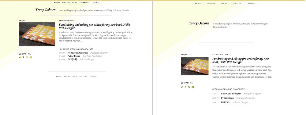
However, whitespace in design (the margins and padding around our elements as well as space between our text and letters) makes our words more readable, our interfaces less chaotic, and our designs feel more professional.
By adding whitespace in a number of places in our widget — between the content and the edges of the green background, between the headline and the paragraph, between the individual lines of text, and within our form — our widget feels more professional and is easier to read.
There isn’t a good shortcut to use here, just a reminder: Use more whitespace than you think you need. Make sure your elements in whatever you’re designing has plenty of margins and space between them, that your text has plenty of space/line-height between the individual lines, and that your design has plenty of space between the content and the edges of the space.
For more, check out these excellent articles:
- Whitespace in Web Design: What It Is and Why You Should Use It
- Using White Space (or Negative Space) in Your Designs
In conclusion, remember to reduce clutter for a better looking and feeling design.
- Line things up and use a grid.
- Limit the number of colors in your design and use a complementary color palette.
- Reduce the number of fonts used.
- Add whitespace.
In short, aim for a “clean” and orderly design.
Of course, design isn’t just how it looks — more importantly, it’s how it works. Stay tuned for part two and part three of this article series, going into user experience as well as looking into the design process and tactics on how you can train your design eye.
This is a three part series on design for non-designers. See Part 2 about user experience here and Part 3 about training your design intuition here.
You can get even more info and tips in my book! Hello Web Design will contain not only the above information but also theory and best-practices in down-to-earth and easy-to-understand terms aimed at programmers and non-designers.
Prices start at $14.95 for the eBook.
Thanks everyone! For any questions, follow and message me on Twitter.
What do you think? Anything I missed? Let me know in the comments below!