Design for non-designers: Part 3
Part 1 of this design series dealt with the visual design, and Part 2 delved into user experience, content, and testing.
Here, we’re going to jump into a bit about theory and reassurances that will help you become a better designer.
Steal like an artist.
Imagine June—she’s a developer who needs to build a new personal homepage to showcase her open source design work. June sits down at her desk and wipes it clear, then pulls out some paper and pens and starts sketching her ideas. :e
Sounds great in theory, right?
It’s far more likely that June will sit and twiddle her fingers, sketch some ideas, get frustrated, try sketching again, then ball her paper up and throw it away.
I know this because I go through this process every time myself if I try to design without researching and finding inspiration first.
Simply put, sitting down to try to sketch ideas from scratch without using any sort of inspiration is a lot like trying to program without having Google or Stack Overflow at your fingertips.
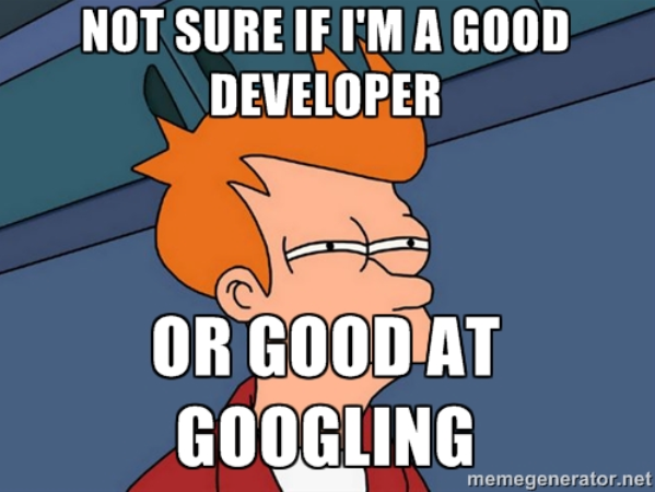
Think of inspiration like visual debugging. Looking at great design and inspiration will help you figure out solutions to problems you may run into when creating your own designs.
Where to find inspiration? For web design, there are tons of websites that simply collect and share good designs.
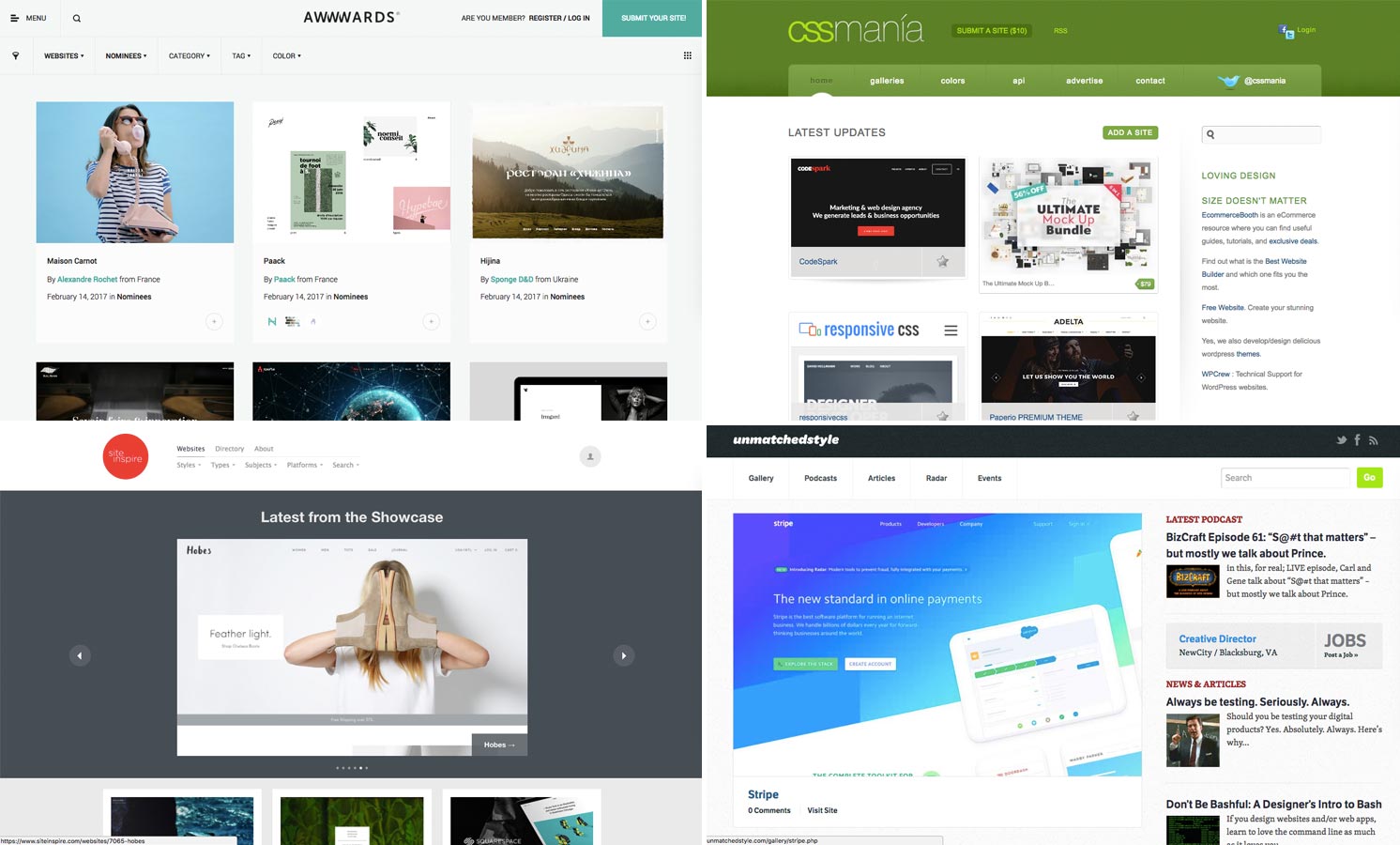
Of course, do not rip off designs. If you find something you like, you can do something similar but ripping off something verbatim is a very big no-no.
My Hello Web App books are inspired by the wonderful A Book Apart books:
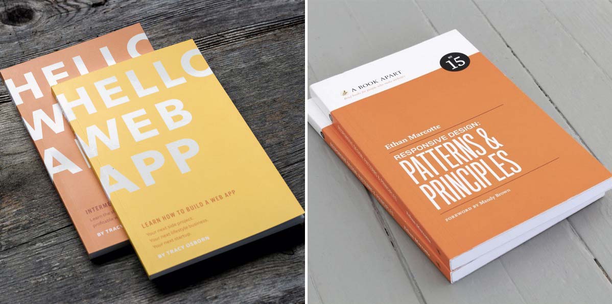
I’m particularly proud of the design I made for Hello Web App, but I sincerely don’t think they would have turned out as nice as they did without being heavily inspired by A Book Apart. Seeing those books helped me determine what I liked in terms of size and thickness, not to mention the flat wonderful colors inspired my own graphic treatment of the Hello Web App cover.
When you find something you love, something that you’d like to do yourself—whether it’s layout, colors, font choices, etc—use that as inspiration to build something similar but not exactly the same.
Train your design eye and intuition.
One of the most useful activities you can do to make yourself better at design is to look at other designs and think critically about what it’s doing well and what it’s doing poorly. Great process to practice while you’re looking for inspiration!
The more you do this (with good designs as well as bad), the more you’ll train your “design eye” and design intuition, making it easier for you to create good designs from scratch.
Let’s use the an old Slack homepage design as an example:
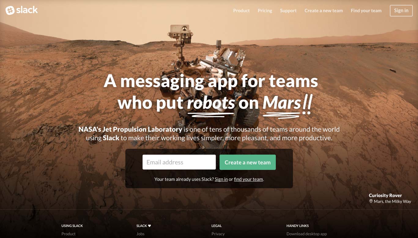
Using the principles we went over above, what would you say they’re doing well? Some of the details I’ve picked out:
- Lots of whitespace. It doesn’t feel like a lot since the background “fills in” the space, but check out the space between the headline and the top of the page — it’s actually quite an airy design.
- Unique headline effect. In the live version of the site, the headline actually animates in. Even in the static version above, the“hand-drawn” underline effect is an unusual element which draws the eye.
- Important words are bolded in the content. Both “NASA’s Jet Propulsion Laboratory” and “Slack” are bold, so you see them first which associates Slack with the prestigious organization.
- Main button is a bright, stand-out color. The background is brown and the “Create a new team” button is a lovely contrasting light green. It’s complementary and yet eye-catching.
- Main form has a dark background. This ensures the text on top is easy to read (since it’s smaller) as well as making the form more eye-catching.
What else can you see that are good design decisions?
Start browsing the web a bit more mindfully and think critically about what designs are doing and your design intuition will improve. Making this a practice will make it easier for you to make better designs naturally.
This is especially important when you’re actively working on a new design. Start out by looking for inspiration in examples of good design in your field as well as looking at your competitors. Pick out what they’re doing well and implement those ideas in your own design. Pick out what you think isn’t working well (especially in your competitor’s designs) and make sure you avoid those things in your own design.
Remember: Design will never feel easy.
I’ve been building websites since I was twelve (20 years of website development!) and I hold an Art & Design degree… and without fail, this is the thought process I have every time I start to work on a new design:
“crap crap crap crap crap crap crap crap crap crap crap crap crap crap crap crap crap crap crap crap crap crap crap crap crap crap crap … yes!”
The first sketches, the first iterations of a design always feel terrible. I stress and worry about how bad my designs feel when I start, until the magical moment when something works and the design starts to come together. Sometimes it isn’t “yes!”, sometimes it can be “maybe?” But it’s never “yes!” right from the start.
If you’re new to design and you feel like your initial iterations are awful — it doesn’t mean you’re a bad designer. It means you’re a designer.
This is a three part series on design for non-designers. See Part 1 about design and clutter here and See Part 2 about user experience here.
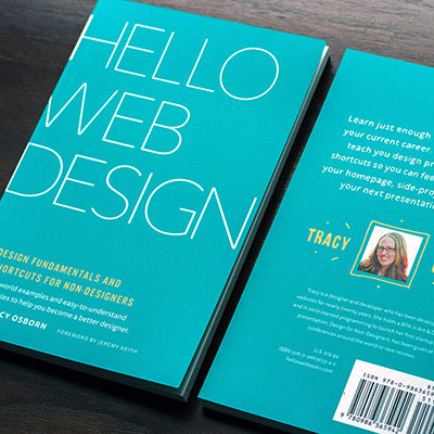
You can get even more info and tips in my book! Hello Web Design will contain not only the above information but also theory and best-practices in down-to-earth and easy-to-understand terms aimed at programmers and non-designers.
Prices start at $14.95 for the eBook.
Thanks everyone! For any questions, follow and message me on Twitter.
Thoughts? Questions? Let me know in the comments below!